8 Minute Read
Visual Hierarchy in Web Design
Guiding User Attention
Web design is one of those complex fields that combines art and science to create a seamless and engaging user experience. One of the key elements in web design is visual hierarchy, which plays a crucial role in guiding user attention, enhancing user experience, and conveying information effectively. In this guide, I'll explore the concept of visual hierarchy, its importance in web design, and practical strategies to implement it successfully.
So, without delay, let's dive in to visual hierarchy!

Table of Contents
- Understanding Visual Hierarchy
- Principles of Visual Hierarchy
- Implementing Visual Hierarchy in Web Design
- Tools and Resources for Visual Hierarchy
- User Testing and Iteration

Understanding Visual Hierarchy
Visual hierarchy is the arrangement and presentation of design elements in a way that directs the viewer's attention and helps them understand the content's importance and structure. It's about creating a clear path for the eye to follow and ensuring that the most important elements are noticed first.
In the context of web design, visual hierarchy involves organizing elements like text, call-to-action buttons, images, and other graphical components in a manner that conveys the intended message and guides the user through the content. By establishing a hierarchy, you can control where the user's eyes go and ensure they engage with your website effectively.
With this in mind, it is also important to consider the visual hierarchy as it relates to a mobile first design strategy.
Why is Visual Hierarchy Important?
Visual hierarchy is crucial in web design for several reasons:
- Communication: It helps convey the website's message or purpose clearly to the users.
- User Engagement: It keeps users engaged by presenting information in an organized and aesthetically pleasing manner.
- Navigation: It aids in effective navigation by guiding users to essential elements, such as menus or calls to action.
- Conversion: A well-structured visual hierarchy can lead to higher conversion rates by emphasizing key actions or information.
- Branding: It supports branding by maintaining consistency in design and content presentation.

Principles of Visual Hierarchy
To create a strong visual hierarchy in web design, you need to understand and apply several key principles. Here are some of the most important ones:
Size and Scale
- Larger Elements: Bigger elements tend to attract more attention. Use larger fonts, images and graphics, or buttons to highlight important content or actions.
- Proportional Scaling: Ensure that the size of elements is proportional to their importance. For instance, a header should be larger than body text, and a prominent call-to-action button should be more significant than other buttons.
- Grouping: Group related elements together by size. For example, if you have a group of buttons, make sure they are all of the same size to indicate their equal importance.
Typography
- Font Choice: Use fonts that are easy to read and align with your website's style. Titles can have decorative fonts, but body text should be highly legible. Remember, typography plays an important role in web design.
- Font Weight: Bold fonts or variations in font weight can draw attention to specific text. Use this to highlight key phrases or headings.
- Whitespace: Adequate spacing around text elements can help draw attention to them. Text surrounded by whitespace tends to stand out more.
Color and Contrast
When choosing a color theme, consider the relevance of color theory in the context of your brand's identity and maintain a consistency.
- Color Selection: Use colors strategically to create visual contrast. For instance, you can use a bright color for call-to-action buttons to make them stand out.
- Color Consistency: Maintain a consistent color scheme throughout your website to create a unified look and feel. Consistency reinforces branding and helps users recognize important elements.
- Background Contrast: Ensure that text has sufficient contrast with the background to make it easy to read. Low contrast can lead to user frustration.
Alignment
The layout design of your website significantly influences conversion, average time on page, bounce rates, and exit rate, so consider the following:
- Grids and Layouts: Use grids to align content elements. This creates a sense of order and structure, making it easier for users to scan and understand your content.
- Centered Elements: Centered elements often carry more weight and attention. Centered headings, logos, or images can draw the user's eye.
- Asymmetry: Intentionally breaking alignment can draw attention to specific elements. However, use this sparingly, as too much asymmetry can create confusion.
Visual Flow
- Eye Movement: Understand how users typically scan a page, which is often in an "F" or "Z" pattern. Place important content along these natural reading paths.
- Directional Cues: Use elements like arrows or lines to guide the user's eye towards key content or actions. A subtle arrow can point towards a call-to-action button, for example.
- Hierarchy Navigation: Create a clear path for users to follow from the most important content to the least important. This guides them through your website in a logical order.

Implementing Visual Hierarchy in Web Design
Now that we've covered the principles of visual hierarchy, let's discuss how to implement them in different aspects of web design. Keep in mind that you want to take a user-centered design approach when implementing these concepts.
Homepage Design
The homepage is often the first point of contact for users, and it should provide a clear introduction to your website's content. Here's how to establish visual hierarchy on your homepage:
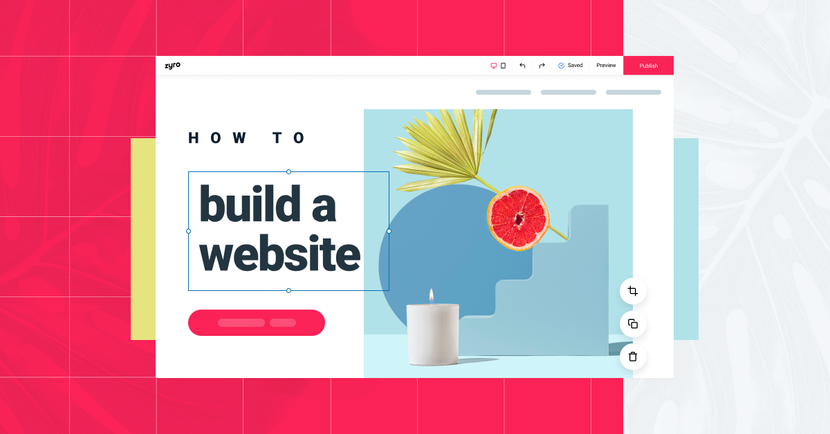
- Hero Section: The hero section, the large and prominent area at the top of the homepage, should feature a compelling image or video, a clear headline, and a call-to-action button. This section sets the tone and captures the user's attention immediately.
- Navigation Menu: The navigation menu, typically at the top of the page, should be easy to find and feature clear labels for each page or section. Consider using a different color or font style to make it stand out.
- Headings and Subheadings: Use larger and bolder fonts for headings and subheadings to guide users through the content. Make sure they are descriptive and engaging.
- Whitespace: Use generous amounts of whitespace to separate sections and create a clean, uncluttered look. This makes the content easier to digest.
- Visual Elements: Use images, icons, and graphics to complement the text. These should support the content and help users understand the message.
- Call-to-Action Buttons: Emphasize call-to-action buttons by using color contrast and size. These buttons could lead to important actions like signing up, making a purchase, or contacting you.
- Testimonials and Social Proof: If applicable, feature testimonials, reviews, or social proof prominently on the homepage. User testimonials can have a significant impact on building trust and credibility.
Navigation Menus
Navigation menus play a critical role in guiding users to different sections of your website. They need to be both visually appealing and functional:
- Position: Place the navigation menu in a consistent and easily accessible location, typically at the top or side of the page.
- Highlight the Current Page: When a user is on a particular page, highlight that page in the navigation menu to indicate where they are.
- Dropdown Menus: If your website has multiple layers of content, use dropdown menus to organize and display subpages. Ensure that these menus are easy to navigate and understand.
- Visual Separation: Use lines or background shading to separate the navigation menu from the rest of the page content. This helps it stand out.
Content Layout
The way you structure and present your content can significantly impact user engagement and understanding. Here's how to create effective content layouts:
- Text Formatting: Use consistent fonts, sizes, and styles for body text. Headings and subheadings should be larger and bold. Italics or underline can be used sparingly for emphasis.
- Columns and Grids: If you have a lot of content, consider using columns or a grid layout to make it easier to read and navigate.
- Visuals and Media: Incorporate relevant images, videos, and infographics to break up long text and make the content more engaging.
- Bullet Points and Lists: Use bullet points and numbered lists to make information more scannable. This is particularly useful for feature lists, benefits, or steps.
- Whitespace: As mentioned earlier, adequate spacing around text and elements makes content easier to read and understand.
- Content Flow: Arrange content in a logical sequence, from the most important to the least important. Ensure that users can easily follow the narrative.
Call-to-Action Buttons
Call-to-action (CTA) buttons are essential for guiding users to take specific actions. Here are some strategies for creating effective CTAs:
- Button Design: Make CTAs distinct by using a different color, size, or shape. Rounded buttons with a contrasting color often work well.
- Text Clarity: The text on CTA buttons should be concise and action-oriented. Use phrases like "Sign Up," "Get Started," or "Buy Now."
- Placement: Position CTAs strategically in areas where users are likely to make a decision or take action. They should be visible without overwhelming the page.
- Consistency: Use consistent CTA design throughout your website to create a recognizable pattern. Consistency reinforces the importance of the action.
- Feedback: Provide visual feedback when users interact with a CTA button. This can be in the form of a color change or animation to indicate a click.
Note: There are a lot of web design trends out there today and I encourage to look at these trends through the lens of user-centered design and the structure of your visual hierarchy. If these trends fail to support a clean visual hierarchy, you should avoid using them.

Tools and Resources for Visual Hierarchy
Creating an effective visual hierarchy in web design often requires the use of tools and resources. Here are some essential tools and resources to consider:
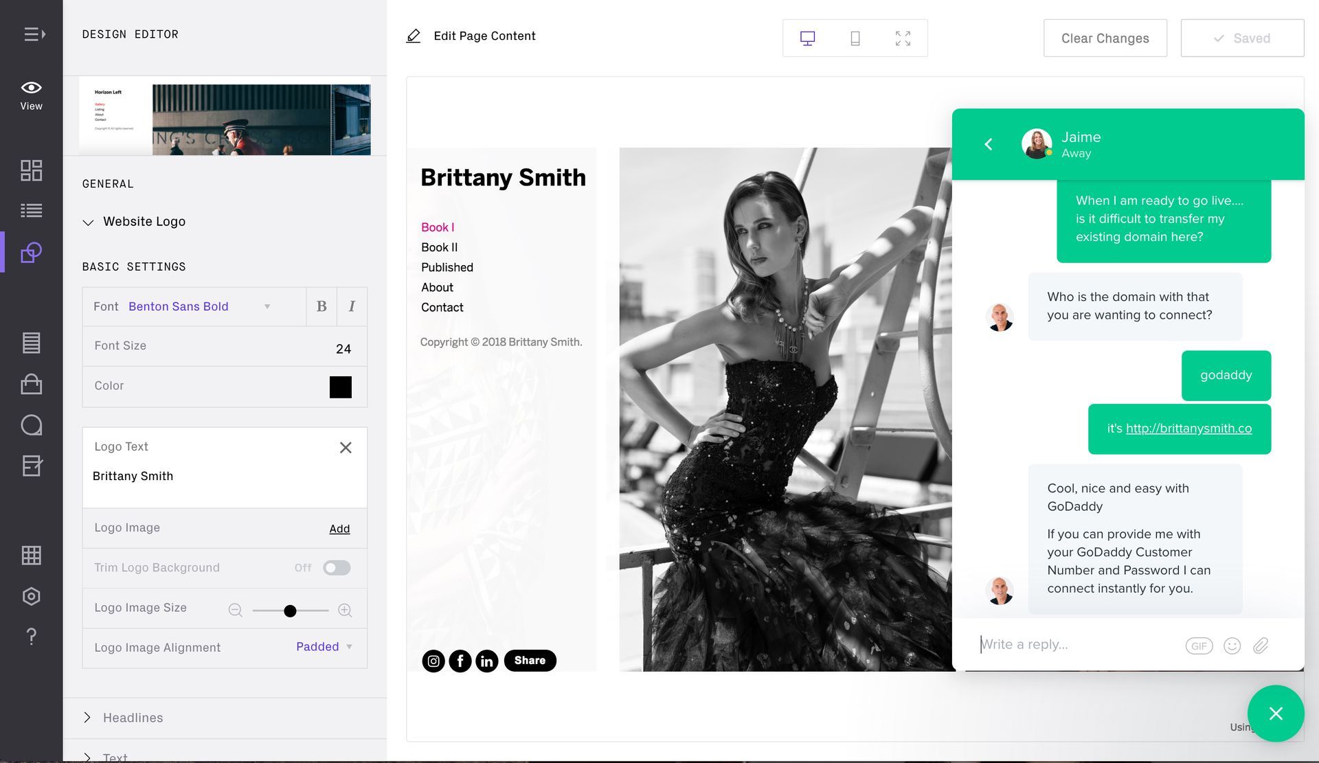
Design Software
- Adobe Photoshop: A powerful tool for creating and editing images and graphics.
- Sketch: A popular design tool for creating user interfaces and web design layouts.
- Figma: A collaborative design tool that allows multiple team members to work on a project simultaneously.
- Canva: A user-friendly graphic design tool that is great for creating visuals and social media graphics.
- Adobe XD: Adobe's solution for designing and prototyping user experiences.
Color Schemes
- Adobe Color Wheel: A tool for creating color schemes based on color theory principles.
- Coolors: An online color scheme generator that helps you find harmonious color combinations.
- Color Hunt: A curated collection of beautiful color schemes for web design.
- Paletton: A color scheme designer that provides options for monochromatic, complementary, and triadic color palettes.
- Material Design Color Tool: Google's tool for creating color schemes following the material design guidelines.
Typography Resources
- Google Fonts: A vast collection of free, open-source fonts that can be easily integrated into web projects.
- Adobe Typekit: A subscription-based service that provides access to a wide variety of high-quality fonts.
- Font Squirrel: Offers a selection of free fonts for web and print use, as well as font-related tools.
- Typ.io: A resource for finding font combinations and inspiration for typography in web design.
- DaFont: A large archive of freely downloadable fonts, including decorative and display fonts.

User Testing and Iteration
Creating a visual hierarchy in web design is not a one-time task; it's an ongoing process that involves user testing and continuous improvement. Many companies across the United States conduct web design case studies to help them determine the best way to create an appealing visual hierarchy. Here's how to incorporate user testing and iteration into your web design process:
The Importance of User Feedback
- Usability Testing: Conduct usability tests with real users to understand how they interact with your website. Identify pain points and areas where users struggle to navigate or find information.
- Surveys and Feedback Forms: Collect feedback from your website's visitors through surveys and feedback forms. Ask them about their experience, what they like, and what could be improved.
- Heatmaps and Analytics: Use tools like Google Analytics and heatmaps to analyze user behavior. Heatmaps can show you where users click, move their cursors, and how far they scroll down a page.
- A/B Testing: Experiment with different design elements, such as button colors, CTA text, or image placement, and compare their performance through A/B testing. This helps you make data-driven decisions.
A/B Testing
A/B testing, also known as split testing, is a method of comparing two versions of a web page or element to determine which one performs better in achieving a specific goal. Here's how to conduct A/B testing for visual hierarchy:
- Hypothesize: Start by identifying an element or design aspect you want to test. This could be the color of a CTA button, the size of a headline, or the layout of a page.
- Create Variations: Create two or more versions of the web page or element, with one being the control (the original) and the others being variations with the changes you want to test.
- Random Assignment: Users are randomly assigned to see either the control or one of the variations. This random assignment ensures that the groups are comparable.
- Data Collection: Collect data on user interactions and behavior, such as click-through rates, bounce rates, or conversion rates. Compare the performance of the control and variations.
- Analyze Results: Analyze the data to determine which version performed better in terms of the specific goal you set. The winning version becomes the new control, and the process can be repeated with further iterations.
Continuous Improvement
- Iterate and Refine: Based on the insights gathered from user feedback and A/B testing, make iterative changes to your web design. Continuously refine the visual hierarchy to improve user experience.
- Stay Updated: Keep up with current design trends, best practices, and web design psychology. Web design is an evolving field, and staying updated will help you implement the latest techniques effectively.
- Competitor Analysis: Analyze the websites of your competitors and other industry leaders to learn from their design choices. While you shouldn't copy them, you can draw inspiration and ideas.
- Accessibility: Ensure that your website is accessible to all users, including those with disabilities. Accessibility is an important aspect of web design and can also impact visual hierarchy.

LATEST ARTICLES