15 Minute Read
web design
Understanding the Key Concepts in Design
Web design is one of those fields that draws upon understanding and applying a variety of concepts. As a web designer or business entrepreneur seeking to build your own website, you need to know about these concepts. In this article, I'll cover some of the major concepts so that you have a better understanding of how they work and how you can apply them.
Let's dive in!

Table of Contents
- What is Web Design
- Typography in Web Design
- Color Theory and Web Design
- Layout Design
- User-Centered Design
- Visual Hierarchy in Web Design
- The Role of Images and Graphics in Web Design
- Mobile-First Design
- Effective Navigation Menus
- Call-to-Action (CTA) Design
- Web Design and Branding
- Web Design Psychology
- Web Design Case Studies
- A/B Testing in Web Design
- Web Design Tools and Software
- Web Design Trends
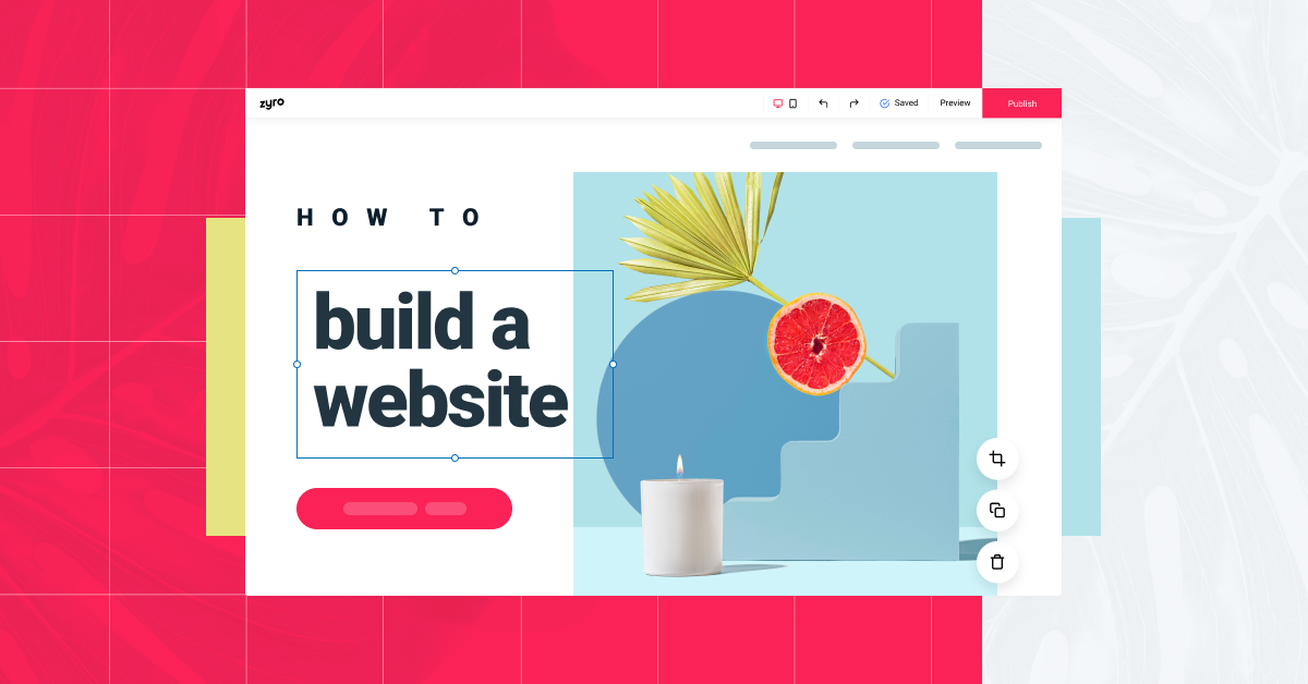
What is Web Design
Web design is the process of creating and arranging the visual elements of a website. It involves the combination of various design principles and technical skills to produce a visually appealing and functional website. Web designers use a range of tools and technologies to design the layout, structure, and overall look and feel of a website.

Typography in Web Design
Typography in web design plays an important role, influencing user experience, readability, and overall aesthetics. Here are some best practices for effective typography in web design:
- Choose the Right Fonts: Select fonts that align with your website's purpose and brand. Use readable and web-safe fonts for the main content and more decorative fonts for headings. Aim for a harmonious font pairing, such as a combination of a serif and a sans-serif font.
- Font Hierarchy: Establish a clear hierarchy to guide readers through your content. Use different font sizes, weights, and styles (bold, italic) to distinguish headings, subheadings, and body text. This helps users quickly identify the most important information.
- Consistency: Maintain consistency in typography throughout your website. Use the same fonts, sizes, and spacing for similar types of content. Consistency promotes a polished and professional appearance.
- Whitespace and Line Spacing: Proper spacing is essential for readability. Ensure an adequate line height to prevent text from feeling cramped. Ample white space around text elements improves comprehension and aesthetics.
- Responsive Typography: Design with responsiveness in mind. Ensure that text resizes and reflows gracefully on different screen sizes and orientations. Use relative units like percentages or ems for font sizes instead of fixed pixels.
- Color Contrast: Ensure there's enough contrast between text and the background to make content legible, especially for users with visual impairments. WCAG (Web Content Accessibility Guidelines) provides standards for contrast ratios.
- Avoid Text Overload: Keep text concise and focused. Use bullet points, lists, and short paragraphs to break up content. Long blocks of text can overwhelm users and deter them from reading.
- Use Web-Safe Fonts or Web Fonts: Choose web-safe fonts to ensure consistent rendering across different devices and browsers. Web fonts, like those from Google Fonts or Adobe Typekit, offer more creative options but can affect page loading times if not optimized.
- Limit Font Varieties: Stick to a few fonts to maintain a cohesive design. Using too many fonts can lead to visual clutter and confusion.
- Typography and Branding: Typography should align with your brand's identity. The chosen fonts should reflect the tone and personality of your website.
- Test Across Devices: Test your typography on various devices and browsers to ensure a consistent and appealing appearance.
- Accessibility: Ensure your typography is accessible to all users, including those with disabilities. Use semantic HTML, provide text alternatives for non-text content, and consider screen reader compatibility.

Color Theory and Web Design
Color theory plays a fundamental role in web design, as it greatly influences a website's aesthetics, user experience, and overall effectiveness. Understanding the principles of color theory and how to apply them in web design is crucial for creating visually appealing and user-friendly websites.
- Color Wheel Basics: The color wheel is a primary tool in color theory. It consists of primary colors (red, blue, and yellow), secondary colors (green, orange, and purple), and tertiary colors (created by mixing primary and secondary colors). Complementary colors are opposite each other on the wheel and create contrast when used together.
- Color Harmony: Creating a visually pleasing color scheme is essential. Different color harmonies, such as analogous (adjacent colors on the wheel), complementary (opposite colors), or triadic (equally spaced colors), can be used to establish balance and harmony in web design. Analogous color schemes, for example, create a calming and unified feel, while complementary colors provide striking contrast.
- Psychology of Color: Colors evoke emotions and can influence user behavior. For example, red may convey excitement or urgency, while blue suggests trust and reliability. Understanding color psychology helps in choosing colors that align with your website's purpose and target audience.
- Accessibility: Ensuring your website is accessible to all users, including those with visual impairments, is crucial. Consider color contrast and text legibility to make your content readable. Tools like the Web Content Accessibility Guidelines (WCAG) provide specific guidelines for color usage in accessible web design.
- Consistency: Consistency in color usage across your website creates a cohesive brand identity. Use a limited color palette and stick to it for headings, text, buttons, and other elements. This not only improves the visual appeal but also enhances usability.
- Responsive Design: Consider how colors appear on different devices and in various lighting conditions. Test your color choices on multiple screens to ensure they remain consistent and attractive across various platforms.
- Testing and Feedback: Before finalizing your color scheme, gather feedback from potential users or stakeholders. A/B testing can help you determine which color choices resonate best with your target audience.

Layout Design
Effective website layout design is crucial for creating a user-friendly and visually appealing online presence. A well-structured website not only enhances user experience but also contributes to better search engine optimization (SEO).
To craft an effective website structure, you should consider various key elements and principles:
- User-Centered Design: Always start with your target audience in mind. Understand their needs, preferences, and behaviors. Create a layout that caters to their expectations. For instance, an e-commerce site should prominently display products, while a blog might prioritize content visibility.
- Clear Hierarchy: Organize your content with a clear hierarchy. Use headings, subheadings, and a consistent navigation menu to guide users through your website. This helps users find what they're looking for quickly.
- Mobile Responsiveness: With the increasing use of mobile devices, your website must be responsive. Design for mobile first and then scale up for larger screens. Ensure that the content and layout adapt seamlessly to different screen sizes.
- Whitespace: Don't overcrowd your pages. Whitespace (or negative space) is essential for readability and focus. It separates elements and makes your content more digestible.
- Consistency: Maintain a consistent design throughout your site. Use a uniform color scheme, typography, and styling elements to create a cohesive brand identity.
- Intuitive Navigation: Make sure your navigation menu is easy to use. Use descriptive labels for menu items, and consider adding a search bar for quick access to specific content.
- Call to Action (CTA): Use strategically placed CTAs to guide users towards desired actions, such as signing up for a newsletter, making a purchase, or contacting you.
- Loading Speed: Slow-loading websites frustrate users. Optimize images and code to ensure quick loading times.
- SEO Considerations: Structure your website to be search engine-friendly. Create clear URLs, use proper HTML tags, and include meta descriptions. This will improve your site's visibility in search results.
- Content Accessibility: Ensure that your website is accessible to all users, including those with disabilities. Use proper alt text for images and follow accessibility guidelines.
- Feedback and Testing: Continuously gather feedback from users and conduct usability testing to identify areas for improvement. A/B testing can help you make data-driven decisions about layout changes.
- Scalability: Plan for future growth. As your website evolves, your structure should accommodate new content and features.

User-Centered Design
User-Centered Design (UCD) is an iterative design process that focuses on creating products or systems that meet the needs and preferences of the end-users. It places users at the forefront of the design and development process, aiming to enhance the user experience and usability of a product. UCD is essential in various fields, including web and app design, product design, and even in architectural planning.
The UCD process typically involves several key stages:
- Research and Understanding: At the core of UCD is the understanding of the users. Designers gather data through methods such as user interviews, surveys, and observations. This information helps in creating user personas and identifying their pain points, preferences, and goals.
- Ideation and Brainstorming: Once user data is collected, designers brainstorm ideas for solutions. They explore various design concepts and features that can address user needs effectively.
- Prototyping: Designers create low-fidelity and high-fidelity prototypes to visualize their ideas. These prototypes can be paper sketches, wireframes, or interactive mockups, allowing users to provide feedback early in the process.
- User Testing: Users are involved in testing the prototypes. Their feedback and interactions help identify areas for improvement. This iterative process is repeated until the design aligns closely with user expectations.
- Implementation and Development: After refining the design based on user feedback, it's time to move into the development phase. The UCD team collaborates closely with developers to ensure the design vision is executed as intended.
- Evaluation and Post-Launch: UCD doesn't end with the product launch. Continuous evaluation and user feedback are vital for making necessary updates and improvements over time.
The benefits of UCD are numerous. It leads to more user-friendly and efficient products, reduces the risk of costly redesigns after the product is launched, and ultimately increases user satisfaction and loyalty. When users feel that their needs are considered in the design process, they are more likely to embrace and promote the product.

Visual Hierarchy in Web Design
Visual hierarchy in web design involves organizing and presenting content in a way that guides the user's attention, making it easier for them to navigate and comprehend the information on a web page. By strategically arranging elements based on their importance, designers can create a more engaging and effective user experience.
This concept can be broken down into several key elements:
- Typography: The choice of fonts, sizes, and styles plays a significant role in directing the user's attention. Important headings or text can be emphasized using larger or bolder fonts, while less important content may use smaller or lighter fonts.
- Color: Color can be a powerful tool for creating visual hierarchy. Vibrant and contrasting colors can draw the eye to important elements, such as call-to-action buttons or headings. Subdued colors may be used for less critical information.
- Whitespace: Adequate white space around elements can help isolate and highlight them. It also contributes to a clean and uncluttered design, making it easier for users to focus on what matters.
- Layout and Positioning: The placement of elements on the page can significantly impact the visual hierarchy. Key content is often positioned at the top or center, as these areas naturally attract attention. Additionally, the "F-pattern" and "Z-pattern" reading behaviors of users can inform how content should be arranged.
- Size and Scale: Larger elements are typically perceived as more important. Using size and scale variations, you can guide users to key information or actions.
- Visual Cues: Icons, arrows, or other visual elements can be used to direct attention and indicate actions. For example, an arrow pointing towards a button can encourage users to click on it.
- Consistency: A consistent design throughout the website helps users establish patterns and expectations, making it easier for them to navigate and locate information.
- Contrast: By creating contrast between important elements and the background or surrounding content, you can make crucial information stand out.
- Hierarchy of Information: Prioritize content based on its importance. Headings, subheadings, and bullet points can be used to structure content and guide users through it.
- Testing and Iteration: User testing and analytics can provide valuable insights into how effective your visual hierarchy is. Based on feedback and data, designers can make necessary adjustments to improve the user experience.

The Role of Images and Graphics in Web Design
Images and graphics play a pivotal role in web design, enhancing the visual appeal and functionality of websites. They contribute to a user's first impression and can significantly impact the overall user experience. Here's a detailed look at their importance and how they are used effectively in web design:
- Visual Appeal: Images and graphics are vital for creating an attractive and visually appealing website. Well-chosen visuals can capture the audience's attention, convey the brand's personality, and leave a lasting impression. High-quality images enhance the overall aesthetics of the site.
- Communication: Visual elements can convey complex messages quickly and effectively. Infographics, icons, and charts are excellent for presenting data, statistics, or processes in an easy-to-understand manner. They engage the audience and simplify the information.
- Branding: Graphics, such as logos and brand-specific visuals, help establish and reinforce brand identity. Consistency in design elements across the website fosters brand recognition and trust.
- User Engagement: Images can be interactive and invite user engagement. For instance, clickable banners, sliders, and image galleries encourage users to explore the website further, increasing their time on the site.
- Emotional Impact: Well-selected images can evoke emotions and connect with the audience on a personal level. They can inspire trust, empathy, or excitement, depending on the context.
- Content Enhancement: Visuals can break up text, making it more readable and scannable. They can also support and illustrate the content, providing context and relevance to the information being presented.
- Navigation: Graphics can be used to guide users through the website. For example, a visual hierarchy, with larger images for main sections and smaller ones for secondary information, helps users navigate the site intuitively.
- Page Loading: Optimized images are essential for fast page loading times. Large or unoptimized images can slow down a website, leading to a poor user experience.
- Responsive Design: Images must be adaptable to various screen sizes and devices. Responsive web design ensures that visuals scale and adjust to fit different screen resolutions and orientations.
- Accessibility: Designers need to consider accessibility when using images. Alt text, for example, makes images accessible to visually impaired users and is crucial for SEO.

Mobile-First Design
Mobile-first design is a fundamental approach in web and app development that prioritizes designing and building digital products with mobile devices as the primary target platform. This strategy has become increasingly important in recent years due to the growing usage of smartphones and tablets for internet access. In a mobile-first approach, the design and development process begins with the smallest screen sizes and then progressively adapts to larger screens, ensuring a seamless and optimized user experience across all devices.
The core principles and benefits of mobile-first design are as follows:
- User-Centric Approach: Mobile-first design prioritizes the needs of mobile users, recognizing that they make up a significant portion of a website or app's audience. By focusing on mobile users, developers can create interfaces that are intuitive and user-friendly on smaller screens.
- Faster Loading Times: Mobile-first design often results in lighter, faster-loading web pages and apps. This is crucial, as mobile users tend to have less bandwidth and slower internet connections compared to desktop users. Faster load times enhance user satisfaction and can positively impact search engine rankings.
- Progressive Enhancement: Starting with mobile design encourages developers to prioritize essential content and functionality. As screen real estate increases on larger devices, additional features and content can be added, providing a more robust experience for users with larger screens.
- Responsiveness: Mobile-first design leads to responsive web design, where websites and apps adapt seamlessly to various screen sizes and orientations. This ensures a consistent and visually appealing experience across a wide range of devices.
- SEO Benefits: Search engines, such as Google, now prioritize mobile-friendly websites when ranking search results. Mobile-first design aligns with these requirements, potentially improving a site's visibility in search engine results.
- Cost-Efficiency: Building for mobile-first can be more cost-effective because it encourages a more streamlined design and development process. Starting with a mobile focus helps identify and prioritize essential features and content, reducing the scope of work.
- Future-Proofing: With the continuous evolution of mobile technology, designing for mobile-first ensures that your digital products are prepared for the ever-changing landscape of devices and screen sizes.

Effective Navigation Menus
Effective navigation menus play a pivotal role in enhancing the user experience on websites and applications. They serve as a roadmap for users, helping them find information and perform tasks efficiently. A well-designed navigation menu can significantly impact user satisfaction, engagement, and overall success.
Here are some key principles and strategies to create effective navigation menus:
- Simplicity and Clarity: Keep your menu simple and easy to understand. Use clear, concise labels for navigation items. Avoid jargon or vague terms. Users should quickly grasp what each menu option represents.
- Hierarchy and Organization: Structure your menu hierarchically. Use clear categories and subcategories to group related content. A logical organization helps users predict where they'll find specific information.
- Consistency: Maintain a consistent menu structure across your website or app. Consistency in layout and design elements, such as color and typography, aids user familiarity and reduces cognitive load.
- Responsive Design: Ensure your menu works well on various devices and screen sizes. Implement responsive design techniques to adapt the menu's layout for mobile, tablet, and desktop users. Mobile-friendly menus, like a hamburger menu, can save screen space.
- Visual Clues: Use visual cues like icons or hover effects to provide additional context to menu items. These cues can help users understand the purpose of each item and make the navigation experience more engaging.
- Search Functionality: Incorporate a search feature, especially on content-rich websites. This allows users to find specific items quickly, reducing the reliance on the menu for navigation.
- User Testing: Conduct usability testing to gather feedback on your menu's effectiveness. Observe how users interact with it, identify pain points, and make improvements based on their feedback.
- Performance: Optimize menu load times to ensure swift navigation. Slow menus can frustrate users, leading to higher bounce rates.
- Accessibility: Ensure that your menu is accessible to all users, including those with disabilities. Use proper HTML and ARIA attributes to make it usable with screen readers and keyboard navigation.
- Personalization: Consider implementing user-specific menu options or recommendations based on user behavior and preferences. Personalized menus can enhance the user experience by offering relevant content or features.

Call-to-Action (CTA) Design
Call-to-Action (CTA) design is crucial for boosting conversions on websites and in marketing materials. An effective CTA not only encourages users to take action but also guides them seamlessly through the conversion funnel.
Here are some key strategies for optimizing your CTA design to maximize conversions:
- Compelling Copy: Craft concise, action-oriented copy that conveys a sense of urgency and value proposition. Use strong verbs and persuasive language that resonates with your target audience. Personalize CTAs based on the specific needs and pain points of your users to make them more compelling.
- Contrast and Visibility: Make your CTAs stand out by using high-contrast colors that draw the user's attention. Ensure that the CTA button is easily visible and distinct from the rest of the content on the page. Experiment with different color schemes and button designs to find what works best for your audience.
- Placement and Size: Position your CTAs strategically in prominent locations where users are most likely to notice them. Consider placing CTAs above the fold to ensure they are visible without requiring users to scroll. Also, optimize the size of the CTA button to make it easy to click on both desktop and mobile devices.
- Clear and Concise Design: Keep the design of your CTA simple and clutter-free. Avoid using too many distractions or unnecessary elements that might divert users' attention away from the primary action. Use clear and legible fonts that are easy to read, even on smaller screens.
- A/B Testing: Continuously test different variations of your CTAs to identify which designs and copy resonate best with your audience. Use A/B testing to compare the performance of different CTAs and make data-driven decisions to optimize your conversion rates over time.
- Mobile Optimization: With an increasing number of users accessing websites on mobile devices, ensure that your CTAs are fully optimized for mobile responsiveness. Use a design that is finger-friendly and provides a seamless user experience across various screen sizes.
- Trust and Credibility: Incorporate trust signals, such as customer testimonials, trust badges, or security certifications, near your CTAs to build credibility and instill confidence in users, especially when dealing with sensitive information or making a purchase.

Web Design and Branding
Web design and branding are vital elements for any business aiming to establish a strong online presence. Achieving consistency in both design and branding is crucial for fostering recognition and trust among your target audience. Consistency in these areas ensures that your brand is easily recognizable and memorable, helping to reinforce your unique identity and message.
Here are some key points to consider:
- Visual Cohesion: Establish a cohesive visual identity across all digital platforms. This includes using consistent color schemes, typography, and imagery that align with your brand's identity. Ensure that the design elements on your website are in harmony with your logo and other branding materials.
- User Experience (UX) Design: Create a user-friendly interface that enhances the overall experience for your website visitors. Implement intuitive navigation, clear call-to-action buttons, and a responsive design that works well across different devices. Consistency in the layout and user interface can significantly improve user engagement and retention.
- Branding Messaging: Maintain consistency in your brand's messaging across your website and other marketing channels. Ensure that the tone, voice, and language used in your content reflect your brand's values and mission. Consistent messaging builds trust and credibility among your audience.
- Logo Placement and Visibility: Place your logo strategically on your website to maximize its visibility and impact. The logo should be clearly visible on every page and link back to the homepage. Consistent placement of the logo reinforces brand recognition and helps users identify your brand easily.
- Content Alignment: Ensure that the content on your website aligns with your brand's values and messaging. Use a consistent tone and style throughout your site, including blog posts, product descriptions, and other textual content. Consistent content helps establish a strong brand identity and fosters a deeper connection with your target audience.
- Social Media Integration: Maintain consistency in branding across all social media channels. Use the same profile pictures, cover images, and brand messaging to ensure a seamless experience for users transitioning from your website to your social media profiles. This cohesive approach helps strengthen brand recognition and fosters a sense of familiarity among your audience.

Web Design Psychology
Web design psychology plays a crucial role in creating a user-friendly and effective website. Understanding user behavior is essential to design websites that engage and convert visitors. In this section, I will discuss key principles of web design psychology and how they impact user behavior.
- First Impressions: Users form an opinion about a website within milliseconds of visiting it. A clean, visually appealing, and organized layout can create a positive first impression. Use high-quality images and a consistent color scheme to establish trust and credibility.
- User-Friendly Navigation: Users expect intuitive navigation. Organize content logically with clear menus and breadcrumbs. Implement responsive design to ensure your website is accessible on various devices.
- Readability and Scannability: People tend to scan web content rather than reading it thoroughly. Use concise paragraphs, bullet points, and headings to make it easy for users to find the information they're looking for. Employ readable fonts and appropriate font sizes.
- Color Psychology: Colors evoke emotions and influence user behavior. For example, blue can convey trust and professionalism, while red can create a sense of urgency. Consider the psychological impact of colors when designing your website.
- Whitespace: White space or negative space is essential for a clean and uncluttered design. It helps users focus on the content and improves comprehension. Avoid overcrowding your pages with too much information.
- Call to Action (CTA) Placement: Strategically place CTAs on your website. Use contrasting colors to make them stand out. The wording of CTAs should be action-oriented, encouraging users to take a specific step, such as "Sign Up Now" or "Buy Now."
- Loading Speed: Slow-loading websites frustrate users and lead to higher bounce rates. Optimize images, use efficient coding, and leverage content delivery networks to improve loading times.
- Social Proof: Incorporate elements like customer reviews, testimonials, and trust badges to build trust and credibility. Users often rely on the experiences of others to make decisions.
- User Testing: Regularly conduct user testing to identify pain points and areas for improvement. Analyze user behavior through tools like heatmaps and analytics to refine your website design continuously.
- Mobile Optimization: With the growing use of smartphones, ensuring your website is mobile-friendly is critical. A responsive design that adapts to different screen sizes is a must.

Web Design Case Studies
Web design plays a crucial role in creating user-friendly and visually appealing websites. Here are a few web design case studies showcasing the impact of effective web design:
- Airbnb: Airbnb's web design evolution is a classic case study. Over the years, they have refined their website's user interface to make it more intuitive and engaging. They introduced high-quality images, a straightforward booking process, and a responsive design to cater to mobile users. These changes contributed significantly to their growth and user satisfaction.
- Apple: Apple's website is known for its simplicity and elegance. They have consistently maintained a clean and minimalistic design, focusing on showcasing their products with high-resolution images and clear product descriptions. This design approach reinforces their brand image and encourages conversions.
- Etsy: Etsy, an online marketplace for handmade and unique products, revamped its web design to improve user experience. They incorporated personalized recommendations, a user-friendly search system, and a responsive design. This led to increased user engagement, longer site visits, and higher sales.
- Reebok: Reebok's website underwent a redesign that included an immersive product browsing experience with 360-degree product views, easy-to-navigate categories, and clear calls to action. As a result, their online sales and user satisfaction improved significantly.
- Gov.uk: The UK government's website is a remarkable case study in public sector web design. They simplified complex government information, improved accessibility, and adopted a user-centric design approach. The result was a highly usable and efficient platform for citizens to access government services and information.
- Stripe: Stripe, a payment processing platform, is an example of a web design that focuses on clarity and simplicity. Their design emphasizes straightforward explanations and a seamless onboarding process, making it easier for businesses to understand and use their services.

A/B Testing in Web Design
A/B testing is a powerful method for optimizing user experience in web design. It involves comparing two versions of a web page, A (the control) and B (the variation), to determine which one performs better in terms of user engagement, conversion rates, and other key metrics. By systematically testing different design elements and content variations, web designers can make data-driven decisions to enhance the user experience.
In an A/B test, you typically choose one specific aspect to test, such as the placement of a call-to-action (CTA) button, the color scheme, or the wording of a headline. The A version represents the current design, while the B version features the proposed change. You then randomly allocate website visitors to see either A or B, and track their interactions.
The key benefits of A/B testing in web design include:
- Data-Driven Decision Making: A/B testing provides concrete, measurable data on which design elements are most effective in achieving your goals. This helps you avoid subjective opinions and gut feelings, ensuring that changes are based on actual user preferences.
- Improved Conversion Rates: By systematically testing variations, you can identify design changes that lead to higher conversion rates, such as more sign-ups, purchases, or engagement.
- Reduced Risk: A/B testing allows you to mitigate risks associated with major design overhauls. Small, incremental changes can be validated through testing, minimizing the potential negative impact of redesigns.
- Enhanced User Experience: Testing helps designers pinpoint elements that contribute to a better user experience, whether it's faster load times, more intuitive navigation, or improved content readability.
- Iterative Improvement: A/B testing is an ongoing process, enabling continuous optimization. You can consistently fine-tune your website for better performance.
To conduct effective A/B testing, you'll need to define clear objectives, set up the test with proper tracking and analytics tools, ensure a statistically significant sample size, and analyze the results. It's also essential to consider the potential limitations and biases that can affect the results, such as the time of day the test is conducted or the source of your website traffic.

Web Design Tools and Software
Building a well-designed website requires several different types of web design tools. Whether you're a seasoned web designer or a newcomer to the field, having the right tools at your disposal is crucial. In this section, I'll outline the essential tools and software you should consider for your web design projects.
- Graphic Design Software: Tools like Adobe Photoshop, Adobe Illustrator, or Canva are essential for creating graphics, logos, and images for your website. These programs help you design visually appealing elements for your site.
- Web Design Software: Web design tools like Adobe XD, Sketch, or Figma enable you to create wireframes, mockups, and prototypes. They provide a visual interface to design your site's layout and user interface.
- Code Editors: For writing and editing HTML, CSS, and JavaScript code, code editors like Visual Studio Code, Sublime Text, or Atom are indispensable. They offer features such as syntax highlighting and autocompletion.
- Content Management Systems (CMS): CMS platforms like WordPress, Joomla, or Drupal simplify website development and management. They offer templates, plugins, and a user-friendly interface for content updates.
- Version Control Software: Using version control software like Git and platforms like GitHub or Bitbucket is crucial for collaboration and tracking changes in your codebase.
- Responsive Design Tools: Ensure your website is mobile-friendly with responsive design tools like Bootstrap, Foundation, or Grid Layout. They provide pre-built frameworks for creating adaptive layouts.
- Browser Developer Tools: Every major web browser has built-in developer tools (e.g., Chrome DevTools). These tools help you inspect and debug your website, ensuring it functions correctly and looks good on different devices.
- Image Optimization Tools: To improve website performance, tools like ImageOptim or TinyPNG can compress and optimize images without sacrificing quality.
- SEO Tools: Tools like Moz, SEMrush, or Google Analytics assist in optimizing your website for search engines, improving its visibility and ranking.
- Collaboration and Communication Tools: Project management and communication tools such as Trello, Slack, or Asana help streamline collaboration with clients and team members.
- FTP Clients: File Transfer Protocol (FTP) clients like FileZilla or Cyberduck are essential for uploading and managing website files on a server.
- Security Tools: Protect your website with security software like Wordfence, Sucuri, or SSL certificates to ensure data and user information are secure.
- Performance Testing Tools: Tools like Google PageSpeed Insights or GTmetrix can help identify and resolve performance issues on your website.

Web Design Trends
Web design trends are always in flux because web design is a dynamic and ever-evolving field, where staying current is essential to create engaging and user-friendly websites. To stay on top of web design trends, it's crucial to keep an eye on emerging techniques and technologies.
Here are some key strategies to help you stay current in this dynamic field:
- Continuous Learning: The web design industry evolves rapidly, so it's vital to embrace lifelong learning. Invest time in online courses, tutorials, and web design blogs to enhance your skills. Platforms like Coursera, Udemy, and Codecademy offer various web design courses to help you keep up with the latest trends.
- Responsive Design: With the growing use of mobile devices, responsive design remains a prominent trend. Ensure your websites are mobile-friendly, optimizing them for various screen sizes and orientations. Familiarize yourself with CSS Grid and Flexbox to create flexible and adaptable layouts.
- UI/UX Design: User experience (UX) and user interface (UI) design are pivotal in web development. Staying current in these areas is a must. Understand the principles of effective navigation, readability, and accessibility. Employ A/B testing and user feedback to refine your designs.
- Web Performance: Page speed and performance have a significant impact on user experience and SEO. Stay updated on tools and techniques for optimizing website performance, such as lazy loading images, minimizing HTTP requests, and using Content Delivery Networks (CDNs).
- Visual Trends: Keep an eye on visual trends such as minimalism, bold typography, and micro-interactions. Experiment with new color schemes, font combinations, and animations to create visually appealing and engaging websites.
- SEO Best Practices: Web design and SEO are interconnected. Stay current with search engine optimization best practices, including structured data, mobile-first indexing, and page speed optimization, to ensure your websites rank well in search results.
- Accessibility: Web accessibility is a growing concern. Familiarize yourself with WCAG (Web Content Accessibility Guidelines) to create inclusive designs for all users, including those with disabilities.
- Design Tools: Web design software and tools continually evolve. Stay up to date with the latest advancements in design software like Adobe XD, Figma, and Sketch.
- Community Involvement: Engage with the web design community through forums, social media, and local meetups. Networking with peers can provide valuable insights into emerging trends and best practices.
- Experimentation: Don't be afraid to experiment and push boundaries. Create personal projects to test new ideas and stay creative.

LATEST ARTICLES