8 Minute Read
Typography in Web Design
Best Practice Standards
Typography in web design is a central aspect that significantly impacts the overall look and feel of a website. It plays a pivotal role in conveying information, creating visual hierarchy, and enhancing user experience. In this guide, I'll explore the best practices for using typography in web design, covering various aspects such as font selection, text hierarchy, readability, and accessibility.
Let's get started!

Table of Contents
- Font Selection
- Text Hierarchy
- Readability
- Typography and Branding
- Typography Accessibility
- Responsive Typography
- Typography Tools and Resources

Font Selection
The choice of fonts is a fundamental decision in web design and user-centered design. It can significantly influence the visual appeal and effectiveness of a website.
Choose Web-Safe Fonts
Web-safe fonts are fonts that are widely available on various operating systems and devices. When using web-safe fonts, you can be confident that your chosen typefaces will display consistently across different platforms. Some common web-safe fonts include:
- Arial
- Helvetica
- Times New Roman
- Georgia
- Verdana
Using web-safe fonts can ensure that your website looks as intended to the majority of users, reducing the risk of font rendering issues.
Consider Web Fonts
Web fonts, also known as custom or downloadable fonts, provide designers with more flexibility and creativity in font selection. These fonts are not limited to what is pre-installed on users' devices and can be embedded into your website using CSS or JavaScript. Popular web font services like Google Fonts, Adobe Fonts (formerly Typekit), and Font Awesome offer an extensive collection of fonts for web use.
When considering web fonts, keep these factors in mind:
- Loading Speed: Web fonts can add to the loading time of your website. Opt for fonts that are hosted on reliable content delivery networks (CDNs) to minimize the impact on page load times.
- Licensing: Ensure that you have the necessary licensing rights to use a web font on your website. Some fonts may have restrictions on usage, especially for commercial projects.
- Fallbacks: Always provide a fallback font in case the web font fails to load or the user has disabled web fonts in their browser. This ensures readability and a consistent user experience.
Maintain Consistency
Consistency in font usage is essential for a cohesive and professional look. When selecting fonts for your website, consider the following:
- Font Pairing: Choose fonts that complement each other. Pair a decorative or distinctive font for headings with a more legible font for body text. There are online resources and tools that can help you find suitable font pairings.
- Font Weights and Styles: Utilize different font weights (e.g., bold, regular, light) and styles (e.g., italic) to create visual hierarchy and emphasize specific content.
- Limit the Number of Fonts: Using too many fonts can lead to a cluttered and confusing design. In most cases, two or three fonts are sufficient to maintain a harmonious look throughout your website.

Text Hierarchy
Text hierarchy refers to the arrangement and styling of text elements to guide users through the content. It helps users identify the importance of various pieces of information on a web page.
Headings and Subheadings
Headings and subheadings are essential for organizing content and providing a clear structure to your web pages. When creating a hierarchy for headings:
- Use HTML heading tags (h1, h2, h3, etc.) appropriately. The h1 tag represents the highest level of importance, followed by h2, h3, and so on.
- Maintain a logical order in your headings. The h1 tag typically represents the page title, while h2 tags represent section headings. This structure helps search engines and users understand the content's organization.
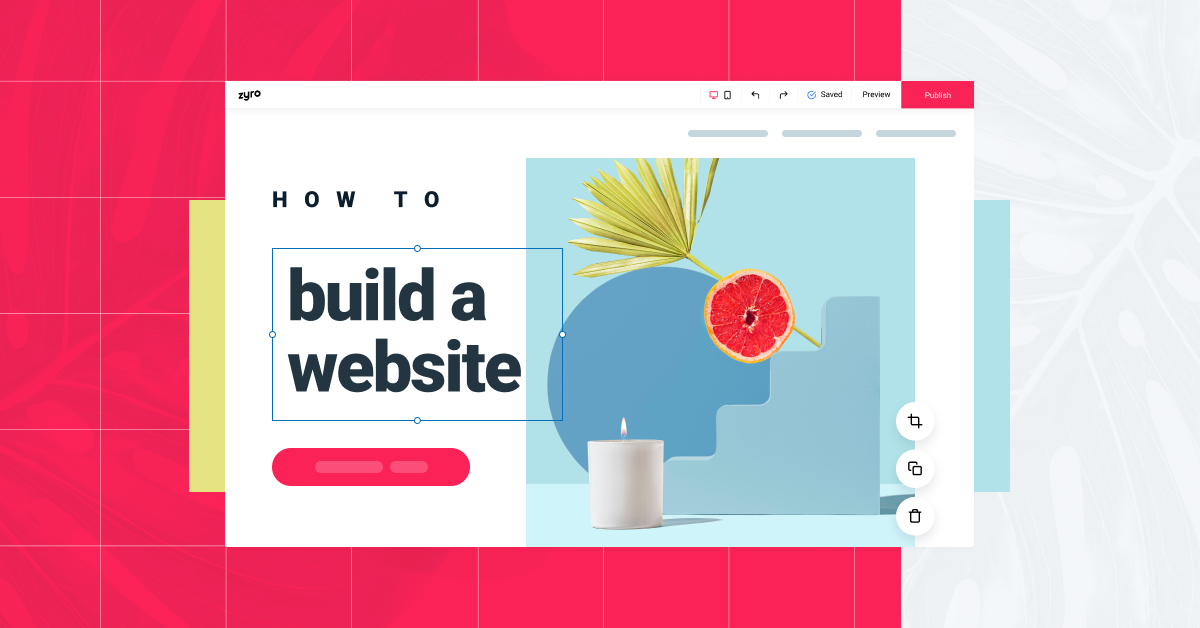
- Differentiate heading levels using font size, weight, and sometimes color. For example, in your layout design, the h1 tag can be the largest and boldest, while h2 tags are slightly smaller but still bold.
Body Text
The body text is where the main content of your website resides, such as articles, product descriptions, or general information. To enhance readability:
- Choose a legible font for body text. Sans-serif fonts like Arial or Helvetica are often preferred for their clarity.
- Ensure an appropriate font size. A common range for body text is 16 to 18 pixels, but this can vary depending on the font you select.
- Pay attention to line spacing (line height). Adequate line spacing improves readability by preventing text from feeling cramped.
- Avoid justifying text, especially for long paragraphs. Left-aligned text is generally easier to read on screens.
Emphasized Text
To draw attention to specific words, phrases, or call-to-action areas you can use emphasized text. This can be achieved through various techniques, such as:
- Bold Text: Use the font-weight property to make text bold. Reserve this for important keywords or short phrases, as excessive bolding can reduce its impact.
- Italics: Italicize text to indicate emphasis or provide a distinct visual style. However, avoid using italics for long passages, as it can affect readability.
- Underlining: Underlining text is less common on the web, as it can be confused with hyperlinks. It's generally best reserved for links or specific cases where a unique style is needed.
- Color: Considering the various aspect of color theory and web design psychology changing the color of text can also be used to emphasize content. However, be cautious with color choices, as they should align with your website's overall color scheme and accessibility standards.

Readability
Readability is a critical aspect of web typography. If users struggle to read your content because of the text layout and how images and graphics are placed around those texts, they are likely to leave your website. Here are some best practices to ensure optimal readability:
Font Size
The size of your text has a profound impact on readability. A font that is too small can strain the eyes, while excessively large text can disrupt the overall design. Consider the following:
- Responsive Font Sizing: Utilize relative units like "em" or "rem" instead of fixed pixel sizes. This allows text to adjust to different screen sizes and user preferences. This is especially important when it comes to creating effective navigation menus and readable content.
- Line Length: The optimal line length for body text is typically between 50-75 characters per line. Longer lines can be challenging to read, while very short lines can lead to excessive line breaks.
Line Spacing
Line spacing, also known as line height, influences how text is spaced vertically. Proper line spacing can improve readability:
- Use line heights that are 1.5 to 1.6 times the font size for body text. This provides enough space between lines without causing text to appear cramped.
- For headings, you can adjust line spacing based on the specific design requirements. In some cases, you might want headings to be closer together for a more compact look.
Line Length
The line length, which refers to how wide a block of text is, plays a significant role in readability. Here's how to ensure an optimal line length:
- For body text, aim for 50-75 characters per line. Longer lines can be difficult to read, while shorter lines may disrupt the flow of the text.
- Utilize responsive design principles to ensure that line length adjusts appropriately on different screen sizes. This prevents excessively long lines on wide screens or overly short lines on narrow screens.
Contrast
Text contrast is vital for readability, especially for users with visual impairments. Follow these guidelines to ensure proper contrast:
- Maintain a high contrast ratio between text and its background. A common recommendation is a ratio of at least 4.5:1 for normal text and 3:1 for large text. This is a key consideration for web accessibility (discussed in more detail later).
- Avoid low-contrast color combinations, such as gray text on a slightly lighter gray background. These can be difficult to read for many users.
- Check your design. Regularly check your design for contrast using online tools or browser extensions to ensure compliance with accessibility standards.

Typography and Branding
Typography can be a powerful tool for reinforcing your branding and creating a memorable user experience. Here are some best practices for aligning typography with your brand:
Match Brand Identity
Your chosen fonts should align with your brand's personality and values. For example:
- A luxury brand may opt for elegant and serif fonts to convey sophistication.
- A tech startup might choose modern, sans-serif fonts to convey innovation and simplicity.
- A children's website might use playful and whimsical fonts to appeal to a younger audience.
Customize Fonts
Customizing fonts can set your website apart and make it more unique. You can do this by:
- Font Modifications: Modify fonts using CSS properties like letter-spacing, line-height, and text-transform to create a distinctive style.
- Custom Fonts: If your budget allows, you can create a custom font specifically for your brand. This can be a significant investment, but it provides complete control over your typography.
Color Selection
The color of your text also plays a role in brand identity. Consider the following:
- Consistency: Use a consistent color palette for text throughout your website to maintain a cohesive look.
- Brand Colors: Incorporate your brand's primary and secondary colors into your typography. For instance, you can use brand colors for headings or emphasized text.
- Readability: Ensure that text colors provide sufficient contrast with the background for readability, while still adhering to your brand's color scheme.

Typography Accessibility
Web accessibility is essential to ensure that all users, including those with disabilities, can access and understand the content on your website. Typography accessibility focuses on making text content more inclusive and usable for everyone and you should conduct A/B testing to determine accessibility and use tools like accessiBe.
Here are some best practices:
Web Content Accessibility Guidelines (WCAG)
The Web Content Accessibility Guidelines (WCAG) are a set of internationally recognized standards for web accessibility. When it comes to typography, consider the following WCAG guidelines:
- Contrast (1.4.3): Ensure that text has sufficient contrast against its background. This is a Level AA guideline.
- Text Resizing (1.4.4): Ensure that text can be resized without loss of content or functionality. This is a Level AA guideline.
- Text Spacing (1.4.12): Ensure that text can be spaced as needed by the user, without loss of content or functionality. This is a Level AA guideline.
- Text Adaptability (1.3.4): Ensure that text can be presented in a way that is easier to read, such as larger font sizes or simpler fonts. This is a Level AA guideline.
High Contrast Text
Using text with high contrast helps users with visual impairments or low vision to read content more easily. Ensure that text and its background have a contrast ratio of at least 4.5:1 for normal text and 3:1 for large text. There are several online tools and browser extensions that can help you check the contrast ratio.
Alternative Text
For non-text content such as images, charts, and icons, provide alternative text (alt text) that describes the content's purpose or meaning. This is particularly important for users who rely on screen readers or have images disabled in their browser settings.

Responsive Typography
With the proliferation of various devices and screen sizes, responsive typography is crucial for ensuring a consistent and user-friendly experience across different platforms. Here are some best practices for a mobile first design approach to typography:
Fluid Typography
Fluid typography allows text to adapt to different screen sizes and orientations. To achieve this:
- Relative units: Use relative units like "em" or "rem" for font sizes, which are based on the font size of the parent element. This allows text to scale appropriately with its container.
- Media queries: Apply media queries to adjust font sizes and styles for different screen sizes. For example, you might increase font size for larger screens or change font styles for portrait and landscape orientations.
- Test: Test your responsive typography on various devices to ensure legibility and consistency.
Media Queries
Media queries are CSS rules that allow you to apply styles based on specific device characteristics, such as screen width or orientation. Use media queries to fine-tune your typography for different contexts:
- Adjust: Adjust font sizes and line heights for various screen widths. For instance, you might increase font size and line height for larger screens to maintain readability.
- Modify: Modify font styles, such as switching to a more condensed font for narrow screens to fit more content.
- Experiment: Experiment with different line lengths for portrait and landscape orientations to ensure text flows well.
Scalable Fonts
Scalable fonts ensure that text remains clear and readable when users zoom in or out on their screens. To achieve scalable fonts:
- Fixed pixel: Avoid fixed pixel sizes for fonts. Use relative units like "em" or "rem" to allow text to scale with the user's zoom settings.
- Test: Test your website's typography at different zoom levels to ensure that text remains legible and maintains its intended design.
Keep in mind that web design case studies show that the use of responsive typography does have a significant impact on the user experience and conversion.

Typography Tools and Resources
To help you implement the best practices for typography in web design and to assist you in creating a clean visual hierarchy, consider using the following tools and resources:
Font Libraries
- Google Fonts: A vast collection of free web fonts that can be easily integrated into your website.
- Adobe Fonts (formerly Typekit): A subscription-based service offering a wide range of high-quality fonts for web use.
- Font Awesome: A popular icon font library that can be used alongside text to enhance your website's visual appeal.
CSS Frameworks
- Bootstrap: A widely used CSS framework that includes typography styles and components.
- Foundation: Another CSS framework with typography options and responsive design features.
- Bulma: A lightweight CSS framework that provides a clean typographic baseline.
Typography Generators
- Type Scale: A web app that helps you create harmonious and responsive typographic scales for your website.
- Typecast: A design and prototyping tool that allows you to experiment with various web fonts and font combinations.
- Fontjoy: A font generator that uses machine learning to suggest font pairings based on your input.
These tools and resources can come in handy when choosing your fonts, however it is also important to consider the latest web design trends and how your fonts may fit into those trends as well.

LATEST ARTICLES