8 Minute Read
Call-to-Action (CTA) Design
Boosting Conversions
In the world of web design, the primary goal is to convert website visitors into paying customers, subscribers, or leads. To achieve this goal, it's essential to create compelling Call-to-Action (CTA) elements that guide your visitors towards taking specific actions. A well-designed CTA can significantly boost conversion rates and improve the overall performance of your website or landing page.
In this guide I'll delve into the art and science of CTA design. I'll explore the importance of CTAs, the principles of effective CTA design, different types of CTAs, best practices, CTA copywriting tips, the use of visual elements, and provide real-world case studies to demonstrate the impact of CTA design on conversion rates.
So, let's look into the wonderful world of call-to-action!
 Design")
Table of Contents
- Understanding Call-to-Action (CTA)
- The Importance of CTA Design
- Principles of Effective CTA Design
- Types of CTAs
- CTA Design Best Practices
- CTA Copywriting Tips
- Visual Elements and Icons
- Case Studies
")
Understanding Call-to-Action (CTA)
A Call-to-Action (CTA) is a specific prompt or instruction that is strategically crafted to encourage a user to take a desired action, thereby compelling them to engage with your brand or website. In the context of digital marketing, a CTA plays a pivotal role in guiding and influencing website visitors towards actions that perfectly align with your overarching business objectives, ultimately leading to increased conversions and revenue generation according to several US based web design case studies.
By employing well-designed CTAs, you can effectively direct your target audience to perform certain actions that are tailored to meet your specific goals, be it signing up for a newsletter, making a purchase, downloading an e-book, or subscribing to a service.
CTAs are essentially the driving force behind successful online campaigns, as they not only capture attention but also create a sense of urgency and excitement, prompting users to take immediate action.
With carefully crafted and strategically placed CTAs, you can not only enhance user experience but also maximize your website's overall effectiveness, boosting engagement levels and cultivating a loyal customer base.
So, whether you are aiming to increase brand awareness, drive traffic, or boost sales, incorporating persuasive CTAs into your digital marketing strategy is an absolute must. Take advantage of the power of CTAs today and watch your business thrive in the ever-evolving digital landscape.
These actions may include:
- Making a purchase
- Signing up for a newsletter
- Downloading a resource
- Requesting a quote
- Contacting customer support
- Sharing content on social media
CTAs can be in the form of well design text typography, buttons, images, or forms strategically placed on your website or landing page. The effectiveness of a CTA is determined by its design, copy, placement, and how well it resonates with your target audience.

Principles of Effective CTA Design
To create CTAs that drive conversions, it's essential to follow specific design principles. Here are the key principles to keep in mind:
Clarity
The first and foremost principle of CTA design is clarity. Your CTA should leave no room for confusion or misinterpretation. Users should immediately understand what the action is and why they should take it. To achieve clarity:
- Use concise and action-oriented language.
- Make sure the CTA stands out visually.
- Avoid jargon or ambiguous terms.
- Place the CTA where users expect to find it.
Visibility
A CTA that users can't see won't be effective. Visibility is about making the CTA prominent on the page. To enhance visibility:
- Use high-contrast colors that stand out from the background.
- Employ white space around the CTA's layout design to make it more prominent.
- Consider using larger or bold fonts.
- Position the CTA in a location where users' eyes naturally land.
Positioning
The placement of your CTA can greatly impact user engagement. The ideal position may vary depending on your website's layout, but some common placements include:
- Above the fold: Above the fold means near the top of the page where it's visible without scrolling.
- Within content: Placed strategically within the text to catch the reader's attention.
- At the end of content: After users have consumed your content, you can guide them towards an action.
- Pop-ups or slide-ins: Triggered at specific times or scroll points for higher visibility.
Color and Contrast
Colors can evoke emotions and influence user behavior. When choosing colors for your CTA, consider the following:
- Use contrasting colors: Make the CTA stand out by using colors that contrast with the rest of the page.
- Consistency: Ensure that the color scheme aligns with your overall website design.
- A/B testing: Conduct A/B testing to test different colors to see which one resonates best with your audience.
Compelling Copy
The text on your CTA is as important as its design. Effective copy can create a sense of urgency, convey the value of taking action, and engage the user's emotions. To create compelling copy:
- Use action verbs: Phrases like "Get started," "Subscribe now," or "Claim your discount" encourage immediate action.
- Convey value: Explain what users will gain by clicking the CTA, such as "Save money" or "Unlock premium content."
- Create urgency: Phrases like "Limited-time offer" or "Don't miss out" can motivate users to act quickly.
- Personalize when possible: Tailor the copy to the user's needs or preferences.

Types of CTAs
CTAs come in various forms, each suited to different contexts and objectives. Understanding the user-centered design approach and the types of CTAs can help you choose the most appropriate one for your specific goals. Here are some common types of CTAs:
Text CTAs
Text-based CTAs are simple and effective. They are usually in the form of hyperlinked text that instructs users to take action. Text CTAs are commonly used for blog posts, articles, and within email marketing campaigns.
Example: "Click here to learn more."
Button CTAs
Button CTAs are one of the most common types. They are visually distinct and come in various shapes and sizes. Button CTAs often have a border, background color, and text, making them highly visible.
Example: "Sign Up," "Buy Now," "Get Started."
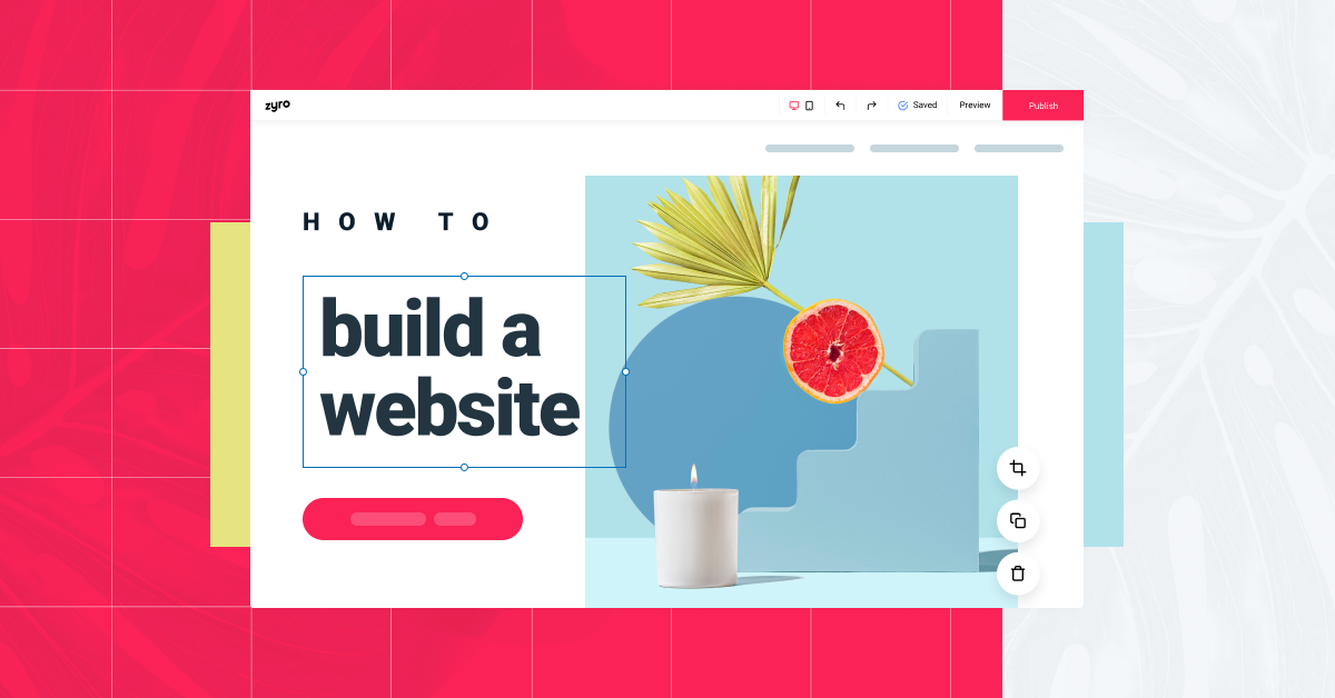
Image CTAs
Image CTAs use images or graphics to convey the action. They can be especially effective when the image provides a clear indication of what the user can expect after taking the action.
Example: An image of a book cover for a "Read Now" CTA.
Form CTAs
Form CTAs are used for lead generation and data collection. They typically include a form for users to fill out in addition to a button or text prompting them to submit the form.
Example: "Subscribe to our newsletter" with a form for entering an email address.
Note: It is important to stay up-to-date on the latest web design trends as they may help you to develop better CTAs.

CTA Design Best Practices
Now that you understand the principles of effective CTA design and the types of CTAs, let's explore best practices to create CTAs that maximize conversions:
Size and Shape
- Button size: Make sure the CTA button is large enough to be easily clickable without being overwhelming. An ideal size is around 44-48 pixels in height.
- Button shape: Rounded and rectangular buttons are common choices. The shape should complement your overall design while still standing out.
White Space
White space, also known as negative space, is the area around your CTA that's free of text or other elements. Ample white space can help draw the user's attention to the CTA. Avoid clutter around your CTA to ensure it remains prominent.
Responsiveness
With the increasing use of mobile devices, it's crucial to ensure your CTAs are responsive. They should adapt to different screen sizes and orientations. Test your CTAs on various devices to ensure they function as intended.
A/B Testing
A/B testing involves creating multiple versions of a CTA and testing them to see which one performs better. You can test different colors, copy, placement, and even the CTA type to determine what resonates most with your audience. A/B testing is an ongoing process that can lead to significant improvements in conversion rates.
Mobile Optimization
Mobile optimization goes beyond responsive design and you should be taking a mobile first design approach. Consider how users interact with your website on mobile devices and make sure your CTAs are easy to tap with fingers. Large, well-spaced buttons are essential for mobile user experience.
Page Speed
The speed at which your web pages load can impact user engagement and conversions. Ensure that your website is optimized for fast loading times. Slow websites can deter users from waiting for your CTA to load, resulting in missed conversion opportunities.

CTA Copywriting Tips
The copy on your CTA plays a crucial role in convincing users to take action while also assisting in your branding efforts. Here are some essential CTA copywriting tips:
Action-Oriented Language
Use action verbs to create a sense of urgency and encourage immediate action. Phrases like "Get started," "Try it now," or "Claim your free trial" can motivate users to click.
Value Proposition
Clearly communicate the value users will receive by taking the action. Whether it's saving money, gaining knowledge, or improving their lives, the value proposition should be evident in your CTA copy.
Urgency and Scarcity
Creating a sense of urgency or scarcity can drive users to act quickly. Mention limited-time offers or the scarcity of a product or service to motivate users to take action before it's too late.
Personalization
Whenever possible, personalize your CTAs to cater to the individual user. This can be based on their browsing history, location, or other relevant information. Personalization makes the CTA more relevant and compelling.

Visual Elements and Icons
Incorporating visual elements and icons can enhance the effectiveness of your CTAs and there are a ton of tools out there that can help you do that.
Here's how to make the most of them:
- Arrows and pointers: Use arrows or other directional cues to guide users' attention towards the CTA. This will also help in establishing a sense of visual hierarchy as well.
- Icons: Icons can add context to your CTA. For example, a shopping cart icon next to "Add to Cart" reinforces the action.
- Imagery: Use relevant images to provide a visual cue of what the user will get by clicking the CTA.
- Animations: Subtle animations, like a button changing color when hovered over in a navigation menu or button, can draw attention to the CTA.

Conclusion
By following best practices in CTA design, such as optimizing size and shape, ensuring responsiveness, conducting A/B testing, and focusing on mobile optimization, you can improve user engagement and drive conversions. Effective CTA copywriting is essential, incorporating action-oriented language, clear value propositions, urgency, scarcity, personalization and an understanding of web design psychology.
Visual elements and icons can enhance your CTAs, providing additional cues to guide users towards action. Real-world case studies demonstrate the tangible impact of well-designed CTAs on conversion rates, making it clear that investing time and effort into CTA design is a strategic move for any digital marketing campaign.

LATEST ARTICLES