8 Minute Read
Effective Navigation Menus
Enhancing User Experience
Navigation menus are a fundamental component of web design, playing a crucial role in enhancing the user experience on websites and applications. They serve as roadmaps that help users easily find the content or features they're looking for. Effective navigation menus are essential in ensuring that visitors can navigate your platform effortlessly, and they contribute to the overall user satisfaction.
In this guide, I'll explore the various types of navigation menus, best practices for their design, and tips for enhancing user experience. I'll also examine real-world case studies to illustrate how successful platforms employ navigation menus to their advantage.
Let's get right to it, shall we!

Table of Contents
- Importance of Navigation Menus
- Types of Navigation Menus
- Best Practices for Designing Navigation Menus
- Tips for Enhancing User Experience with Navigation Menus
- Case Studies

Importance of Navigation Menus
Navigation menus are the backbone of any website or application, and their significance cannot be overstated. Many web design case studies have revealed that a clean and well designed navigation menu will lead to higher conversion rates.
Here are some key reasons why they are vital for enhancing user experience:
- Usability: Navigation menus provide a clear and organized structure to your content, making it easy for users to explore and access information or features.
- Orientation: Users often arrive at your platform with specific goals or questions in mind. Navigation menus guide them to relevant sections, preventing frustration and ensuring they quickly find what they need.
- Accessibility: They improve accessibility for users, especially those with disabilities, by offering alternative methods to browse content.
- Consistency: Well-designed menus maintain consistency throughout your site or app, ensuring that users understand the layout and can navigate without having to relearn it.
- Aesthetics: A well-crafted navigation menu can enhance the visual appeal of your site or application, contributing to a positive first impression.
Types of Navigation Menus
There are various types of navigation menus that can be used in web and app design. The choice of menu type depends on the specific goals of the platform and the preferences of the target audience. Here are some common types of navigation menus:
Top Navigation Menus
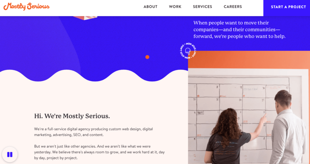
Top navigation menus are positioned at the top of the webpage or app, usually in a horizontal orientation. They are easily accessible and offer a clean and unobtrusive way for users to navigate especially with the right type of typography usage.
- Advantages:
- Easily accessible, as they are at the top of the page.
- Familiar and widely used.
- Suitable for a limited number of primary categories.
- Disadvantages:
- Limited space for a large number of categories or items.
- May not be the best choice for mobile devices with limited screen width.
Sidebar Navigation Menus
Sidebar navigation menus are located on the side of the webpage or app, typically on the left or right. They are useful for platforms with a significant amount of content or complex structures.
- Advantages:
- Can accommodate a large number of categories.
- Ideal for platforms with complex information hierarchies.
- Allows for the use of icons to aid recognition.
- Disadvantages:
- Can take up a significant portion of the screen, potentially reducing the space available for content.
- May not be suitable for mobile devices with limited screen width.
Hamburger Menus
Hamburger menus are a common sight on mobile devices and should be carefully considered when taking a mobile first design approach. They are represented by three horizontal lines (resembling a hamburger) and are typically located in the top corner of the screen.
- Advantages:
- Saves screen space on mobile devices.
- Offers a clean and minimalist design.
- Reveals navigation options when needed, reducing clutter.
- Disadvantages:
- May not be immediately obvious to all users.
- Users might not discover all available options.
Tabbed Navigation
Tabbed navigation menus are frequently used in web applications to organize different sections or views. Each tab represents a different category or feature.
- Advantages:
- Easily switch between different sections or features.
- Visually appealing and organized.
- Disadvantages:
- Limited space for a large number of tabs.
- May not be the best choice for platforms with a deep hierarchy of content.
Mega Menus
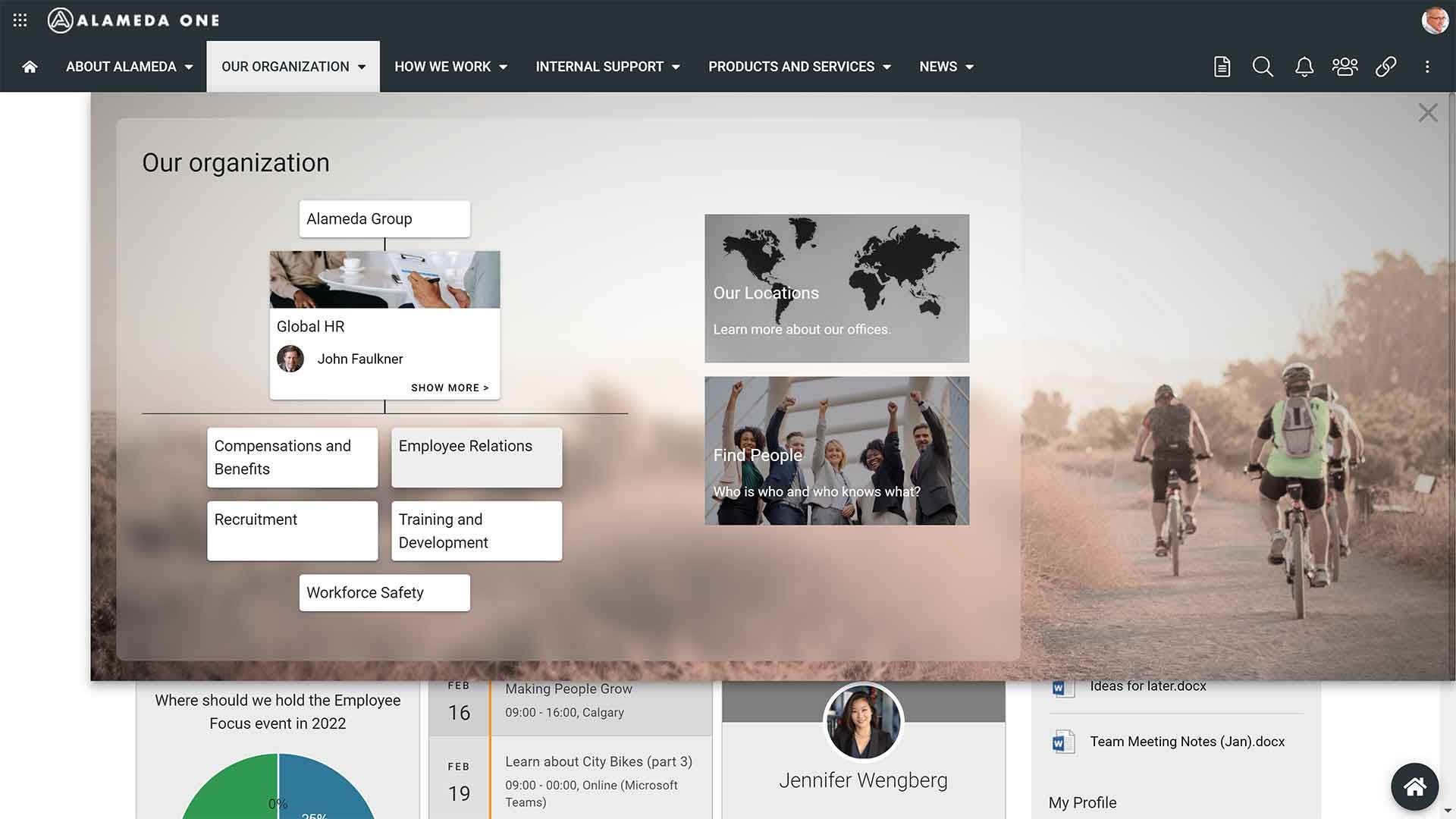
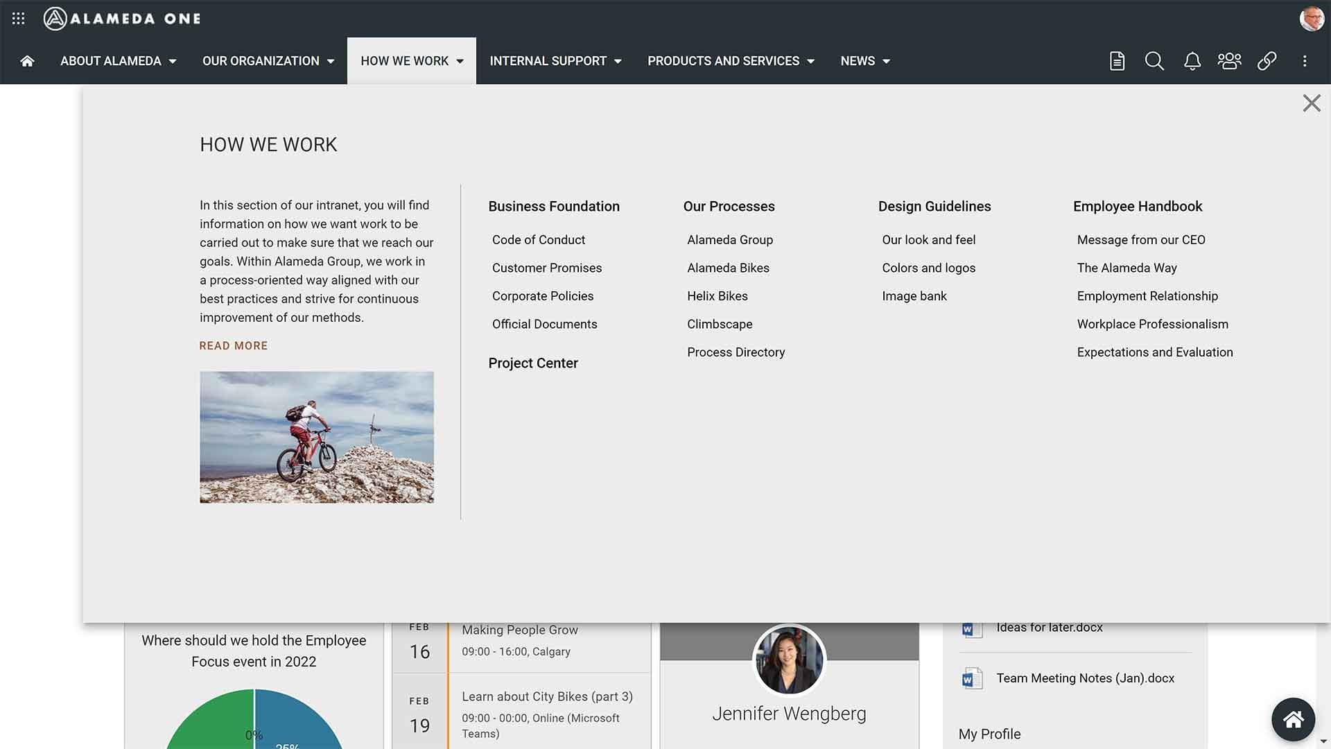
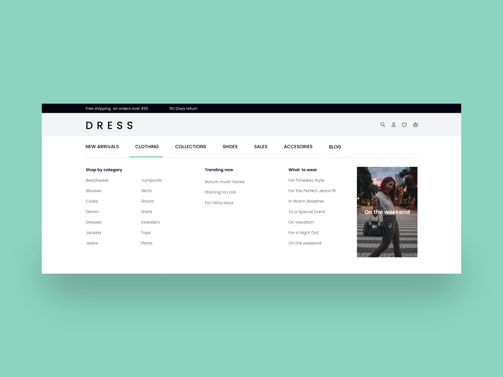
Mega menus are expansive drop-down menus that display multiple layers of navigation options, images or graphics, and content when users hover or click on a menu item. They are particularly useful for websites with a vast amount of content or products.
- Advantages:
- Accommodates a large number of categories and subcategories.
- Provides a structured way to display complex information.
- Disadvantages:
- Can be overwhelming if not organized properly.
- May not work well on touch-based devices.
Best Practices for Designing Navigation Menus
Effective navigation menus are not only about the choice of menu type but also about their design and implementation. Before you begin to create your website or navigation menu, make sure that you have web design tools that align with these best practice standards.
To enhance user experience, consider the following best practices:
Keep It Simple
- Limit the number of menu items to the essentials. Cluttered menus can overwhelm users and make it harder for them to find what they're looking for.
- Prioritize primary categories or content. Place the most important items at the top level of the menu.
Use Clear and Concise Labels
- Write labels that are self-explanatory. Users should be able to understand what a menu item represents without ambiguity.
- Avoid jargon or industry-specific terminology that may confuse your audience.
Maintain Consistency
- Keep the menu layout, style, and colors consistent across all pages of your website or application. Users should not have to relearn navigation when moving from one page to another.
- Use a consistent style for your menu items, including font, color, and spacing.
Responsive Design
- Ensure that your navigation menu adapts to different screen sizes. Mobile-responsive design is crucial to accommodate users on various devices.
- For mobile devices, consider using alternative menu types like hamburger menus to save space.
Accessibility
- Design your menus to be accessible to all users, including those with disabilities. Use proper HTML markup and provide alternative text for images.
- Test your navigation menu with screen readers and keyboard navigation to ensure that it's usable for everyone.
Tips for Enhancing User Experience with Navigation Menus
Apart from the general best practices, there are several additional tips to make your navigation menus even more user-friendly and effective. With that being said, keep an eye out for the latest web design trends, as some new trends may offer more efficient navigation styles.
Effective Categorization
- Group related menu items together. Use logical categories and subcategories to make it easier for users to locate information.
- Conduct user testing to determine the most intuitive way to organize your menu items. Doing this will help you maintain a user-centered design approach.
Dropdown Menus
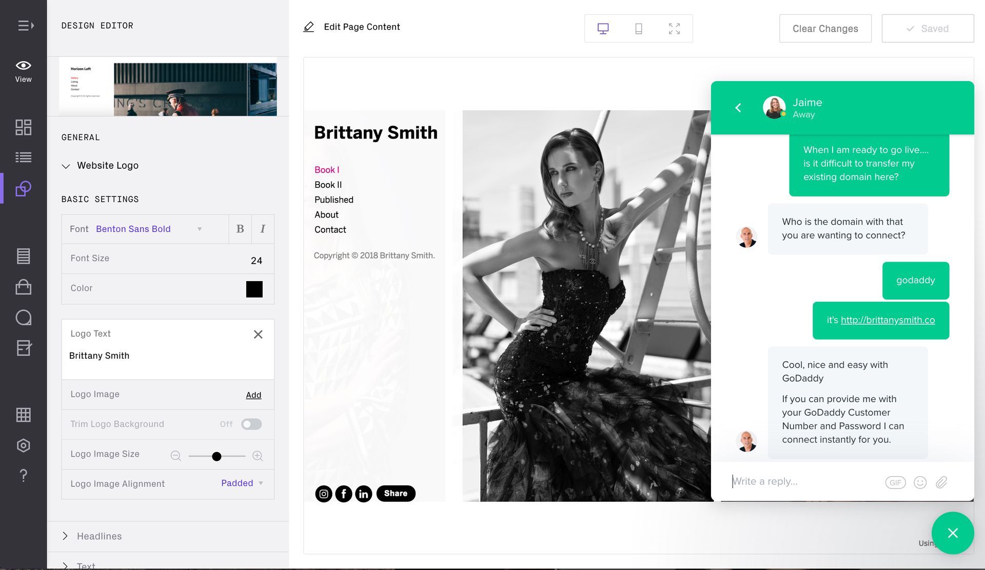
- Implement dropdown menus when you have a hierarchy of content. They can reveal subcategories or additional options when users hover or click on a menu item.
- Ensure that dropdown menus are easily accessible and work well on both desktop and mobile devices.
Search Functionality
- Include a search bar as part of your navigation. Search is a vital feature that allows users to find specific content quickly.
- Use autocomplete suggestions to assist users in formulating their search queries.
Breadcrumbs
- Implement breadcrumb navigation to show users their current location within your website or application.
- Breadcrumbs make it easy for users to retrace their steps and explore related content.
Visual Clarity
- Use visual cues like icons or arrows to indicate submenus, especially in complex navigation structures.
- Highlight the currently active menu item to provide users with a clear sense of where they are in the navigation. This will also help to affirm the visual hierarchy of a website.
- If you have a call-to-action button or a click-to-call tracking button, ensure that the buttons are placed in a clear area that is uncluttered.
Feedback and Animation
- Provide visual or auditory feedback when users interact with the menu. This feedback can include changing the color of a selected item, showing loading animations, or providing sound effects for clicks.
- Use subtle animations, like fade-ins or transitions, to make menu interactions more engaging without being distracting.
Case Studies
To illustrate the effectiveness of well-designed navigation menus, let's look at some case studies of popular websites and applications.
Amazon
Amazon is one of the world's largest e-commerce platforms, and its success is partially attributed to its intuitive navigation menu and branding style. Here's what Amazon does right:
- Clear Top Navigation: Amazon uses a top navigation menu with clear categories such as "Shop by Department," "Today's Deals," and "Amazon Music."
- Effective Mega Menu: When hovering over a category like "Shop by Department," users are presented with a mega menu that displays subcategories, making it easy to find specific products.
- Search Functionality: Amazon prominently features a search bar, allowing users to search for products using keywords or filters.
- Responsive Design: Amazon's menu adapts to different screen sizes, ensuring a consistent user experience on desktop and mobile devices.
Airbnb
Airbnb, a popular platform for booking accommodations, demonstrates effective navigation design and a good understanding of web design psychology. Here are some notable aspects:
- Simplified Hamburger Menu: On mobile devices, Airbnb uses a hamburger menu to keep the interface clean. It reveals navigation options when users tap on it.
- Clear Labels: The menu items are labeled in a straightforward manner, such as "Explore," "Stays," and "Experiences," making it easy for users to understand the options.
- Effective Categorization: Airbnb categorizes accommodations and experiences, allowing users to quickly access the content they are interested in.
- Visual Clarity: The use of high-quality images and icons enhances the visual appeal of the platform and helps users understand their options.
Dropbox
Dropbox, a cloud storage and file-sharing service, employs a clean and user-friendly navigation menu. Here's what Dropbox does well:
- Top Navigation: Dropbox uses a simple top navigation menu with labels like "Home," "Files," "Paper," and "Showcase."
- Dropdown Menus: When users click on "Files," a dropdown menu provides access to folders, files, and sharing options, offering a clear hierarchy of features.
- Search Functionality: Dropbox features a search bar to find files quickly, a crucial feature for a file storage service.
- Feedback and Animation: Dropbox provides feedback through color changes when hovering over menu items, giving users a sense of interaction.
When considering these case studies, keep in mind that these companies ran all sorts of A/B testing scenarios and took user feedback very seriously.
